NATIVIA® rebranding: the evolution of the logo
Since its revolutionary launch in 2010, NATIVIA® has stood at the forefront of sustainable packaging innovation. What began as a pioneering venture in biaxially oriented PLA films has evolved into a comprehensive portfolio of solutions that continues to reshape industry standards. Now, as NATIVIA® embarks on its next chapter, a complete rebranding initiative reinforces this evolution with a refined visual identity that communicates maturity, integration, and unwavering commitment to sustainability.
A legacy worth celebrating
NATIVIA® didn’t just enter the market—it revolutionized it. As one of Taghleef Industries’ most forward-thinking innovations, NATIVIA® introduced the packaging industry to a new generation of films that challenged conventional approaches. The brand’s initial commitment to biobased and industrial compostability solutions established new benchmarks for sustainable packaging performance, proving that environmental responsibility and functional excellence could coexist.
Over more than a decade, NATIVIA® has grown into a complete family: today’s expanded portfolio encompasses multiple levels of product protection and complete end-of-life solutions designed to meet the evolving needs of high-value applications. With the integration of innovative materials like PHAs, the introduction of home compostability features, and functionalization with advanced barrier technologies, NATIVIA® continues to lead industry transformation.
The story behind the new design
To strengthen this evolution, Taghleef Industries initiated a comprehensive rebranding for NATIVIA®. The renewed visual identity communicates a powerful narrative centered on two fundamental principles: integration and commitment.
Integration of new biopolymers
The brand has evolved from exclusively BOPLA films to an integrated portfolio of biaxially oriented films based on a mix of innovative biopolymers. This technical expansion required a visual language that could encompass the full breadth of solutions while maintaining brand coherence. The rebranding reflects NATIVIA®‘s journey from a single-material specialist to a comprehensive provider of biobased and biodegradable film solutions.
Commitment to Sustainability and Innovation
The rebranding represents NATIVIA®’s journey toward making sustainability the industry standard rather than the exception. This isn’t simply an update. It’s a declaration that sustainable packaging has matured from an alternative to the primary solution for forward-thinking brands and converters.
Design elements: form follows meaning
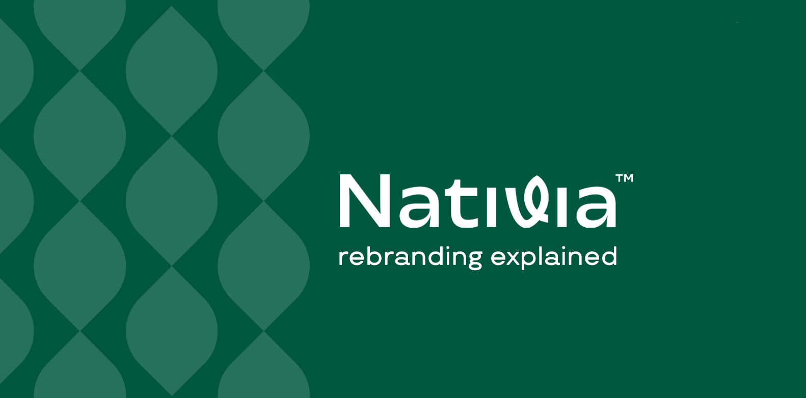
The most visible change centers on the iconic leaf element that has always been synonymous with NATIVIA®. Previously positioned as a separate component above the letter “I,” the leaf has now been organically integrated into the wordmark itself. This integration illustrates the brand’s core philosophy: sustainability is not an add-on or afterthought but an intrinsic part of every solution NATIVIA® delivers.
This seamless incorporation of the leaf symbol represents how biobased materials are becoming naturally integrated into the packaging industry’s DNA. Just as the leaf flows within the logo rather than sitting apart from it, sustainable solutions are now woven into the fabric of packaging design rather than existing as separate alternatives.
The previous logo featured a distinctive two-tone green design that highlighted “Ti” to symbolize the brand’s heritage as part of Taghleef Industries. While this connection remains important, the transition to a single, sophisticated shade of green reflects the brand’s mature market positioning – confident and independent while remaining an integral part of the Taghleef family.
The meaning of green
The new deeper green tone was carefully selected to communicate multiple dimensions of the NATIVIA® brand promise:
- Maturity – The refined shade represents a nuanced approach to sustainability that goes beyond surface-level claims. It reflects years of research, development, and real-world application that have proven these solutions work at commercial scale.
- Confidence – The solid, unified color demonstrates a brand secure in its market leadership. NATIVIA® has earned its position through consistent innovation and reliable performance, not through marketing alone.
- Sophistication – The elegant tone aligns perfectly with premium and high-value applications. Luxury brands and quality-conscious converters demand packaging that reflects their own standards—the new NATIVIA® visual identity speaks their language.
- Timelessness – Unlike trendy colors that may feel dated in a few years, this enduring shade represents a sustainable choice that transcends market trends. It communicates permanence and long-term commitment rather than temporary positioning.
Looking forward
The NATIVIA® rebranding represents more than a simple portfolio expansion, it embodies Taghleef Industries’ unwavering dedication to sustainable innovation and market leadership. As regulatory frameworks tighten, consumer expectations rise, and the circular economy becomes operational reality rather than aspirational goal, NATIVIA® stands ready to meet tomorrow’s challenges with today’s most advanced biobased and biodegradable film solutions.
The evolution of the logo mirrors the evolution of sustainable packaging itself. What once stood apart as an alternative now integrates seamlessly into mainstream applications. What once required compromise now delivers premium performance. What once represented future possibility now defines present capability.
The leaf integrated into the NATIVIA® wordmark tells this story at a glance: sustainability isn’t separate from packaging excellence: it is packaging excellence. And as the industry continues its necessary transformation toward environmental responsibility, NATIVIA® will continue setting the standards others follow.
This is more than a new look. It’s a statement of where NATIVIA® has been, what it has achieved, and where it’s headed—leading the packaging industry toward a more sustainable future, one innovative film at a time.